Setting up Hubspot CTAs and how to position them on your website
- the Button CTA > where you can style freely using CSS or the pre-defined dropdown styles, and
- the Image Button CTA > wherein you can upload an image and use it as the CTA.
1. How to create a CTA
When creating a CTA, you need to:
- Navigate to Marketing > Lead Capture > CTAs.
- Then click on Create CTA orange button, then you can see this sliding window from the right pane.
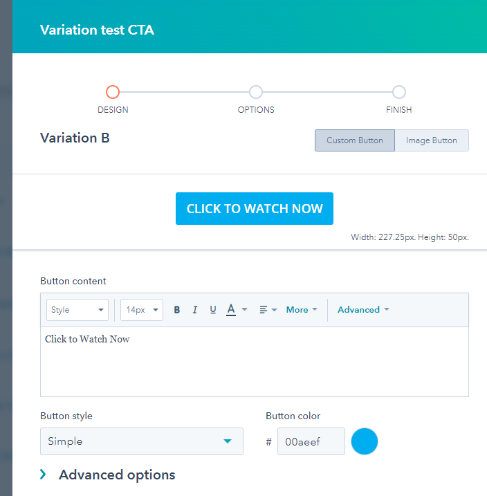
- When creating a Button CTA, you need to go to CTAs > Create CTA then select the Custom Button as the option, then you can populate all the details below like, Button content, Button style, Button color, and even add button size, custom class and custom CSS under Advanced options.

- On the other hand, when creating Image Button CTA, you need to go to CTAs > Create CTA then select the Image Button as the option, upload your desired Image as the button, customize to your desired width if necessary and add Alt text, and hit Next.

Pro tip around Image Button CTAs
You can upload a GIF image to include movement on your CTA. This makes for a more engaging experience with a much higher likelihood for click-through than basic and pure static images, when appropriate to use a GIF Image.
2. How to use the CTA or Embed them on an external website
After creating your desired CTA with internal names, links, and designated campaign, you can then use it anywhere on your website or you can also embed it on an external website page.
If you want to embed the CTA on an external web page:
- You need to go back to the CTA lists.
- Hover over to your desired CTA.
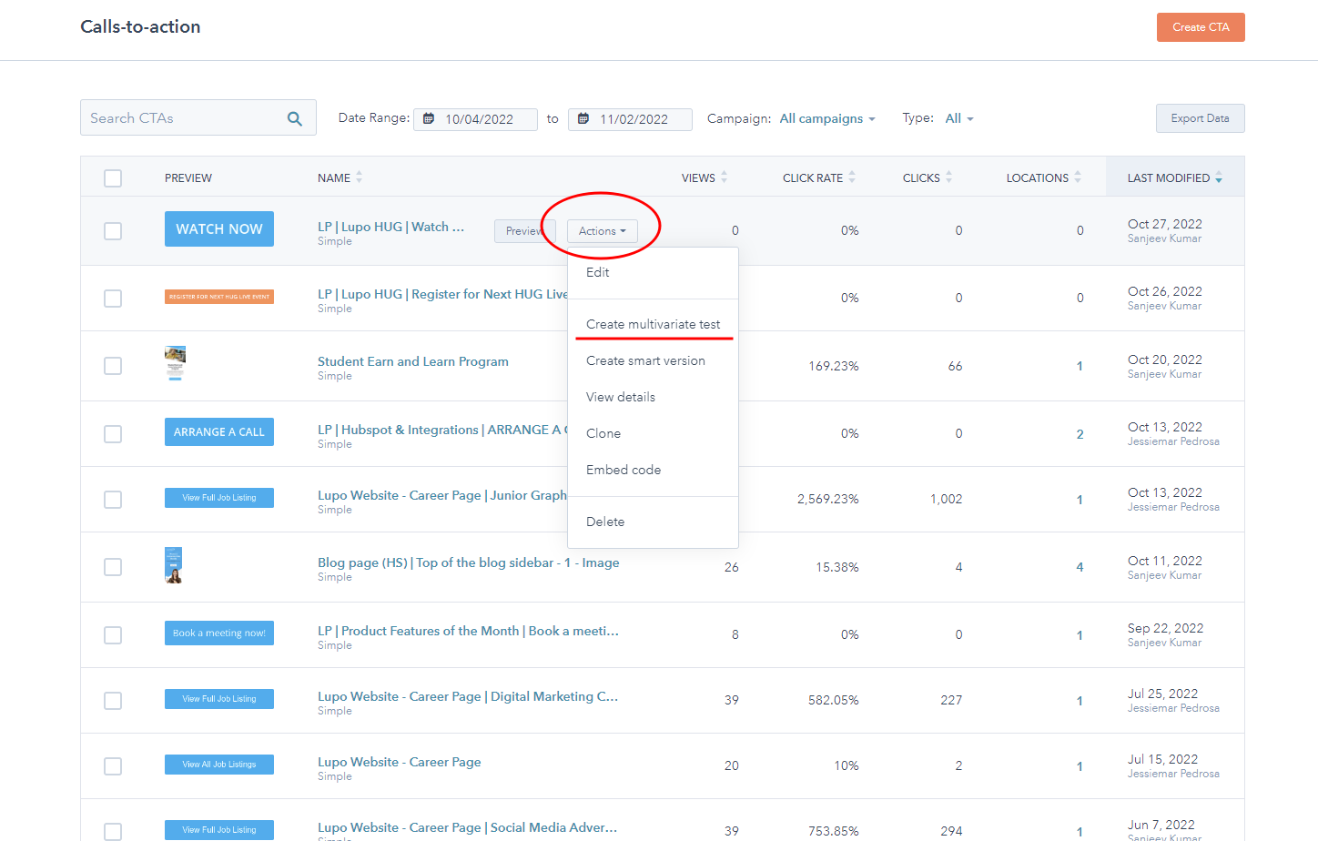
- Click on the Actions button, then click Embed code, and copy the code provided.

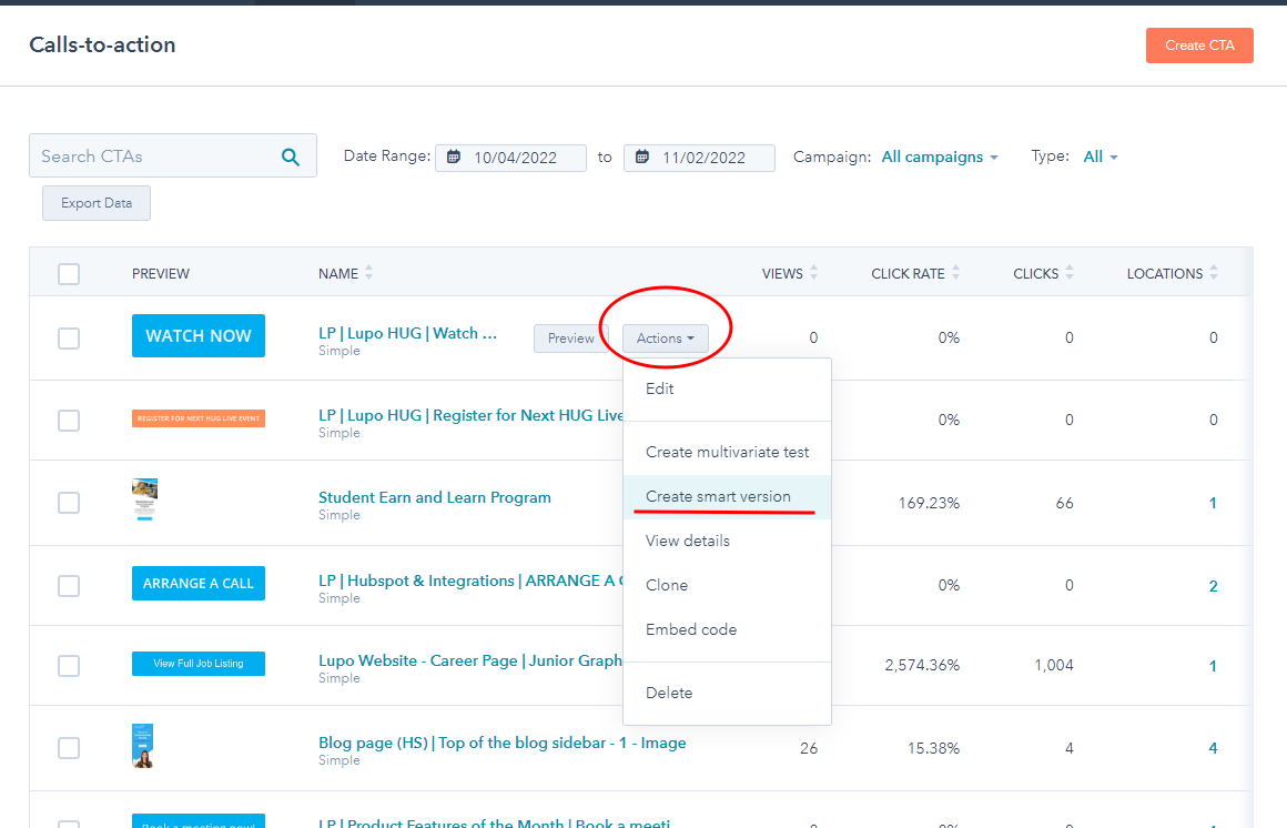
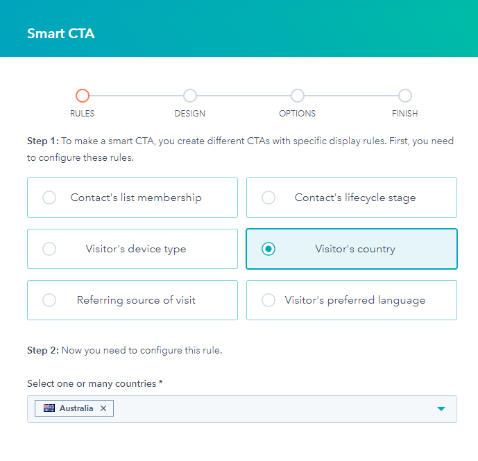
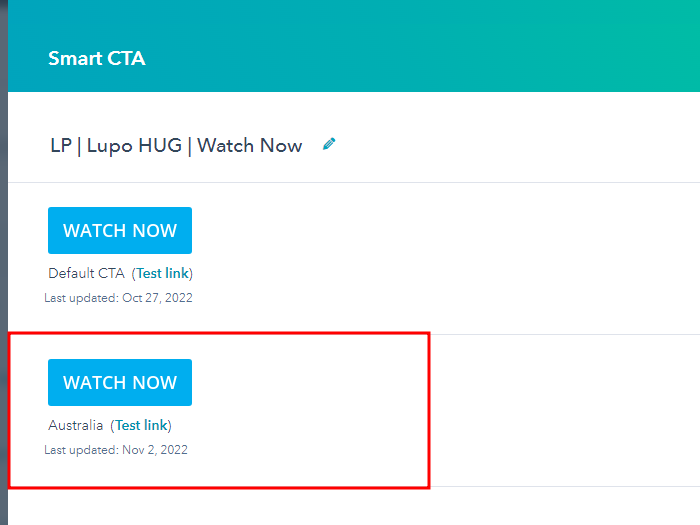
NOTE: You can also create a multivariate test for your CTA to execute an A/B test, or create a smart version of your CTA with different versions depending on specific display rules.
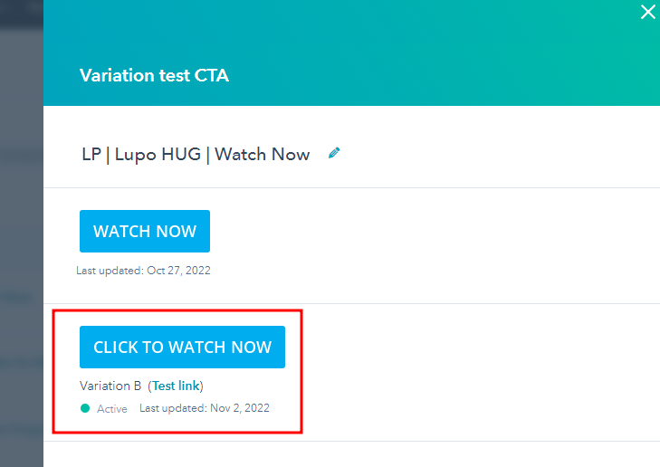
2A. How to create a CTA for A/B testing
2B. How to create a Smart Version from your CTA
3. Where to add or position your CTA on the site
When using a Drag & Drop theme or page, you can search for the CTA module on the left side pane, and easily drag it to any area of your page strategically.
Thus, when positioning CTAs on your website, you need to make sure it is attractive, and proactive in the sense that it gets your visitor's attention, and can be easily located on your website for almost all ages. The CTA needs to have a clear purpose and also ensure the button text is straight to the point for maximum efficiency.
Here's one best example of an Image CTA & Button CTA combined in one web page

4. CTA clicks and in-depth analytics
Additional to the details above, after setting up and placing your CTAs on the website, you can also see the CTAs analytics and how it performs. Due to their highly targeted insights based on purpose, they help you avoid the need for analytics tools and long analytics measurement plans, by simply using a CTA for the said purpose and checking in on the results.
Navigate to go to the CTA Lists, choose the desired CTA you want to analyse, click on Actions, then View Details.
You can see here the Clicks, Submissions, and CTA placements on your website or external links.

CTA positioning and placement on the website is subjective and is an individual's choice but considering all the common placements being used by most agencies, editors or content strategist would be a big factor to start on your website and study how it performs and converts on your own website analytics.